

Bad UI Design in Windows Control Panel April 15, 2011
If you use Windows Vista or Windows 7, take a look at the small icon view in the Control Panel.
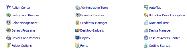
Try to look for the "Device Manager" icon. Then look for "Color Management". Have you noticed anything awkward?
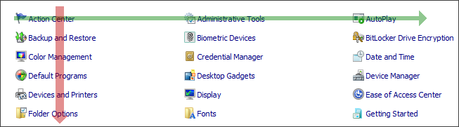
Icons in the Control Panel are organized in columns, yet they are sorted alphabetically and laid out in left-to-right reading order. This layout violates our natural visual scanning pattern. When items are grouped in columns, we tend to read from top to bottom, starting from the left most column, and then move to the next column from top to bottom.
It's interesting to point out that more users tend to read in such order even when items are not in columns. In a perfect grid where the eyes can scan either way, vertical scanning is a more popular choice. This could be that we are "conditioned" by column layouts in websites, and have learned to handle up-and-down scrolling. Horizontal scrolling, on the other hand, is not as well practiced.
Now resize the Control Panel window, and look for "Device Manager" and "Color Management" again. You may find it annoying that the locations of the icons have changed. It is no big deal if you only need to find an item once in a while. For repeated tasks, the extra scanning time and effort adds up.
The position of controls should be fixed, so that it is possible for the users to establish a mental map.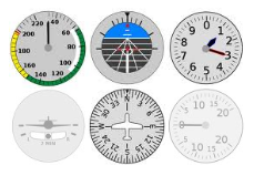 After using the consistent interface a few times, visual scanning is no longer needed, as the action in mind is directly linked to the control at the finger tip.
A classic example of consistent user interface is the arrangement of flight instruments. Early planes had 4 basic gauges, forming the "Basic T" arrangement. The Royal Air Force later chose a set of six essential instruments, extending "Basic T" to "Basic Six". The standardization of panel layout has greatly reduced the pilot training cost. To find out more about flight instruments, check out this page.
To summarize the lessons learned from the bad user interface design in Windows Control Panel, guard the following principles:
Try to look for the "Device Manager" icon. Then look for "Color Management". Have you noticed anything awkward?
Icons in the Control Panel are organized in columns, yet they are sorted alphabetically and laid out in left-to-right reading order. This layout violates our natural visual scanning pattern. When items are grouped in columns, we tend to read from top to bottom, starting from the left most column, and then move to the next column from top to bottom.
It's interesting to point out that more users tend to read in such order even when items are not in columns. In a perfect grid where the eyes can scan either way, vertical scanning is a more popular choice. This could be that we are "conditioned" by column layouts in websites, and have learned to handle up-and-down scrolling. Horizontal scrolling, on the other hand, is not as well practiced.
Now resize the Control Panel window, and look for "Device Manager" and "Color Management" again. You may find it annoying that the locations of the icons have changed. It is no big deal if you only need to find an item once in a while. For repeated tasks, the extra scanning time and effort adds up.
The position of controls should be fixed, so that it is possible for the users to establish a mental map.
After using the consistent interface a few times, visual scanning is no longer needed, as the action in mind is directly linked to the control at the finger tip.
A classic example of consistent user interface is the arrangement of flight instruments. Early planes had 4 basic gauges, forming the "Basic T" arrangement. The Royal Air Force later chose a set of six essential instruments, extending "Basic T" to "Basic Six". The standardization of panel layout has greatly reduced the pilot training cost. To find out more about flight instruments, check out this page.
To summarize the lessons learned from the bad user interface design in Windows Control Panel, guard the following principles:
- arrange items in natural visual scanning order
- fix the position of controls whenever possible
Antradar 2026 ©

Antradar Software Inc.
Antradar Software Inc.
1-888-404-1337
http://www.antradar.com
Toronto,
ON M8V1J5
Canada