

Capturing Realistic Signatures June 4, 2013
As signature pads become more common, the print-out of captured signatures gets exceedingly rough. Although a signature is a signature, regardless whether it's signed with a pen, stylus or finger, or signed on paper or a touch screen, a butchered signature simply cannot be taken seriously.
We set out to tackle the issue of electronic signatures looking like MS Paint drawings. The main challenge we're facing is that most touch input devices are not pressure-sensitive. In addition, we aim to create a purely web-based signature pad that operates on both mobile phones as well as legacy browsers. A mouse, for example, is definitely not pressure-sensitive.
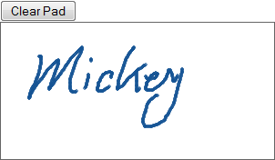
We rolled our own JavaScript signing widget that looks like the following:
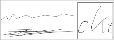
The widget stores the drawing in strokes. Each stroke contains a series of coordinates. We've established that it's important to use vector since a bitmap version looks awful on print:

The following image is constructed by connecting the points:
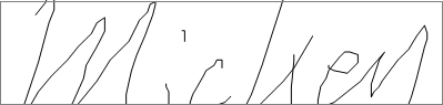
The lines are jagged for two reasons: 1. it's difficult to draw perfectly straight lines with your hand; and 2. the touch device tracks pixels in coordinates - a bitmap grid. Unless each point is linearly correlated with one another, the line won't look straight. And because the touch device doesn't have unlimited resolution, the lines never look smooth.
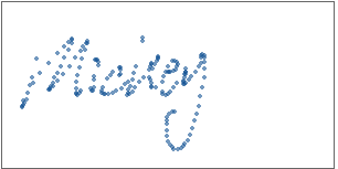
A quick solution is to identify only the key points:
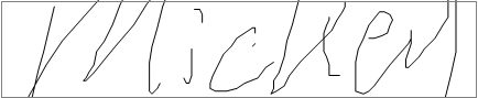
Now the signature looks more reasonable:
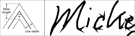
The strokes on a pen-drawn signature have variant widths, even if the signature is written with a hard ball-point pen. Our electronic signature has no width variation, but we can use the interpolating points that we dropped in the previous step to emulate stroke inconsistency. The idea is to rearrange the points in a way such that a stroke consists of multiple overlapping lines. The following diagram illustrates the concept by exaggerating the interpolation deviation. We can see that the strokes now look not so monotonic.
The last, and a very important element we had to tweak was the miter length. A miter connects two stroke segments. A proper miter joint length can create pen-drop and lift effects. When the path angle is too steep, however, the miter protrudes the path, making the signature look "spiky".
Finally we increased the path width so that the signature is more filled out:
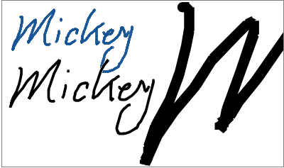
The print copy looks almost identical (and slightly better) than the original capture. In a way, we magnified a bitmap image into a vector graphics! We can see, upon close examination, that the stroke path has "cracks", just like strokes from an ink pen or a pencil.
Case closed.
We set out to tackle the issue of electronic signatures looking like MS Paint drawings. The main challenge we're facing is that most touch input devices are not pressure-sensitive. In addition, we aim to create a purely web-based signature pad that operates on both mobile phones as well as legacy browsers. A mouse, for example, is definitely not pressure-sensitive.
We rolled our own JavaScript signing widget that looks like the following:
The widget stores the drawing in strokes. Each stroke contains a series of coordinates. We've established that it's important to use vector since a bitmap version looks awful on print:
The following image is constructed by connecting the points:
The lines are jagged for two reasons: 1. it's difficult to draw perfectly straight lines with your hand; and 2. the touch device tracks pixels in coordinates - a bitmap grid. Unless each point is linearly correlated with one another, the line won't look straight. And because the touch device doesn't have unlimited resolution, the lines never look smooth.
A quick solution is to identify only the key points:
Now the signature looks more reasonable:
The strokes on a pen-drawn signature have variant widths, even if the signature is written with a hard ball-point pen. Our electronic signature has no width variation, but we can use the interpolating points that we dropped in the previous step to emulate stroke inconsistency. The idea is to rearrange the points in a way such that a stroke consists of multiple overlapping lines. The following diagram illustrates the concept by exaggerating the interpolation deviation. We can see that the strokes now look not so monotonic.
The last, and a very important element we had to tweak was the miter length. A miter connects two stroke segments. A proper miter joint length can create pen-drop and lift effects. When the path angle is too steep, however, the miter protrudes the path, making the signature look "spiky".
Finally we increased the path width so that the signature is more filled out:
The print copy looks almost identical (and slightly better) than the original capture. In a way, we magnified a bitmap image into a vector graphics! We can see, upon close examination, that the stroke path has "cracks", just like strokes from an ink pen or a pencil.
Case closed.
Antradar 2026 ©

Antradar Software Inc.
Antradar Software Inc.
1-888-404-1337
http://www.antradar.com
Toronto,
ON M8V1J5
Canada