

Grid Layout Systems Are Unproductive March 14, 2017
It's a bold claim - the grid layout systems, ones that are present in many popular CSS frameworks, are not as productive as they seem. In fact, they are cumbersome to use and uncomfortable to maintain.
First, what is a grid system? Consider the following example:
 a web page is abstracted as the above grid. We can see there are two types of divisions - a half-half division, and a 2:1 split.
We could use a set of reusable CSS classes to implement the above layout:
<div class="row">
<div class="col-one-half"></div>
<div class="col-one-half"></div>
<div class="col-one-half"></div>
</div>
<div class="row">
<div class="col-two-thirds"></div>
<div class="col-one-third"></div>
</div>
In practice, the grids are often nested for logical grouping:
<div class="row">
<div class="col-one-half"></div>
<div class="col-one-half">
<div class="row">
<div class="col-one-half"></div>
<div class="col-one-half"></div>
</div>
</div>
</div>
<div class="row">
<div class="col-two-thirds"></div>
<div class="col-one-third"></div>
</div>
So far so good. We can see that the grid is easy to understand and subsequently easy to build. How can it possibly be difficult to maintain?
"Easy to Build" vs. "Easy to Maintain"
A common misconception about maintenance is that it happens after a product is released. In fact, maintenance happens as early as the moment there is a specs change. One thing to remember about software development is that things always change. First let's give the layout some context:
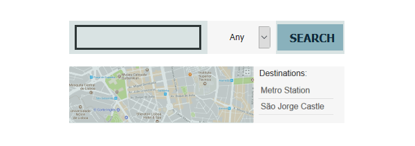
Now we see that in this Property Search application, the search bar takes up half of the space. The room type and search button divide up the rest. The map uses two-thirds of the space, leaving one third for a list of local attractions.
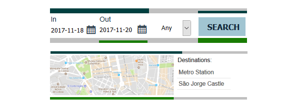
To the programmer's greatest reluctance, the requirements changed: this Hotel Booking application now needs a check-in and check-out date. The original 1:1, sub 1:1 structure now has to be changed to 3:1 and sub 1:1:1. Now we have to change two layers of containers:
<div class="row">
<div class="col-one-half">
<div class="col-three-quarters">
ADDRESS
<div class="row">
<div class="col-one-third">IN</div>
<div class="col-one-third">OUT</div>
<div class="col-one-third">TYPE</div>
</div>
</div>
<div class="col-one-half">
<div class="col-one-third">
<div class="row">
<div class="col-one-half">TYPE</div>
<div class="col-one-half">BUTTON</div>
</div>
</div>
</div>
Imagine a fully implemented page where between the DIV tags are not just simple labels. It would be a hassle to scroll up and down, restructuring the containers and sub containers while balancing the tags. Logically we took out one element and added in two. Why do we have to change so much markup?
CSS was invented almost specifically to solve this problem - to alleviate the burden of altering markups by externalizing the layout definitions. The above issue we see are typically experienced with editing tables. Think about it, the <tr> <td> tags are just as easy to learn and versatile to use. Look where that got us?
The true promise of a CSS framework, in this regard, is that the programmer doesn't have to change much of the CSS code. However, tons of maneuver are required on the markup side. In contrast, this is how we typically implement such layout:
<style>
#addr,#checkin,#checkout,#type,#button{float:left;}
#addr{width:50%;}
#checkin,#checkout{width:25%;}
#type{width:25%;}
#button{width:25%;}
</style>
<div id="searchview">
<div id="addr">ADDR</div>
<div id="checkin">IN</div>
<div id="checkout">OUT</div>
<div id="type">TYPE</div>
<div id="button">BUTTON</div>
<div class="clear"></div>
</div>
Yes, it's a lot simpler. In addition, our container carries semantic identifiers instead of generic column class names. This makes is much easier to target and transform the elements.
Another change is the screen dimension. As we narrow the window, the list on the side of the map becomes too tight. We would like to widen that column ever so slightly. In a grid system, we could do the following:
<style>
@media screen and (max-width:900px){
.col-two-thirds{width:66%;60%;}
.col-one-third{width:33%;40%}
</style>
The issue here is that when we change the grid here, we change the grid everywhere. Many websites do not actually solve this problem. Instead they use a more granular 12-grid layout, or sometimes even with more columns, to make the problem less obvious. Want a wider list of map points? Sure, but it comes with a wider side search, a wider sub menu, etc., whether you like it or not. Also it's common to see that one-third is no longer one-third uptake. The generic class names have lost even their generic meaning.
Of course one can add class names or IDs, but that's essentially using our approach.
Frameworks such as bootstrap attempt to address this issue with varying layouts. For example, on a tablet we use a 6:4 layout, and on a desktop a 4:1 split:
<div class="col-md-6 col-sm-4">MAP</div>
<div class="col-md-4 col-sm-1">SIDE</div>
This is a very inflexible way of looking at your layout. The content in each container is different. They may need to be accommodated with their own breakpoints. Imagine each element is one of your 3 children. You have "weekday schedule (desktop)" and "weekend schedule (tablet)". On weekdays, bed time for all of your children is 9pm; one weekends, 11pm. Rules like this could make one child going to bed too sleepy and another one still too wired.
When we build websites, we don't think in "view modes". A layout is fluidly transformed to show case each component in its best light. The map could have a few breakpoints without affecting others:
<style>
#map,#poi{float:left;}
#map{width:75%;}
#poi{margin-left:1%;width:24%;}
@media screen and (max-width:900px){
#map{width:60%;}
#poi{width:40%;}
}
@media screen and (max-width:460px){
#map{width:auto;float:none;margin-bottom:20px;}
#poi{width:auto;float:none;}
}
</style>
<div id="map">MAP</div>
<div id="poi">LIST</div>
<div class="clear"></div>
We have probably given too much credit to frameworks that are generic and allow their users to care less about the subject matter. There is no shame of detailed work. We should also judge the maintainability of a system by whether changes to a single component can be localized, and changes to common traits can be unified, and how easily the component of interest can be targeted.