
Server Access Dashboard Playbook January 3, 2022
The Server Access Dashboard report is bundled in many Gyroscope deployments where a Bingo Bridge is enabled. The dashboard has two components - a "log streamer" service that replicates the HTTP access log into a ClickHouse database in real time; and a faceted navigation report in Gyroscope.
The Dashboard is a versatile tool that provides instant and actionable insight into the usage pattern and performance characteristics of the monitored web application or applications. In this article, we will demonstrate how the Dashboard can be used to identify intrusion attempts, compromised user accounts, unoptimized resources, performance bottlenecks, and emerging trends.
Intrusion Attempts
The Server Access Dashboard has a collection of filters and visualizations. There is no fixed sequence of applying them. But we can look at one investigative trail.
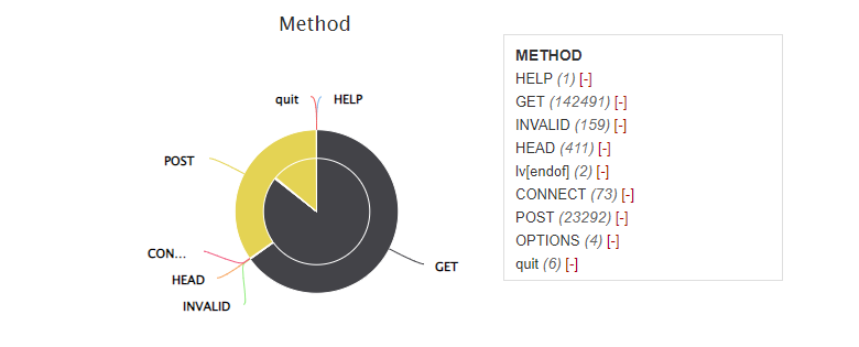
An informational website typically has mostly GET requests. The POST method is used to submit form data. We can apply the Method=POST filter. So how did the server respond to all the POST requests? Let's look at the HTTP Status breakdown:
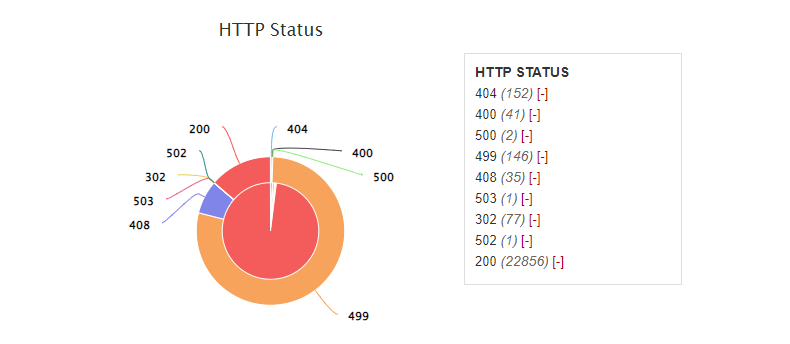
Pie charts in the Dashboard have two layers. The inner pie shows the request count. And the outer ring the total server response time. If all requests were created equal, the outer and inner parts would align perfectly. In the above chart, we see that Status 200 takes the lion's share in terms of request count. However, most time was spent on Status 499 - a client-side timeout.
Now we can read through the server access grid to get a sense of the traffic:
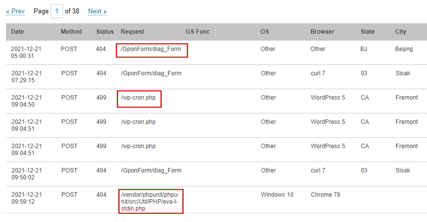
The highlighted fields show the attack vectors. For example, the GponForm is a vulnerable web form in a router. Some automated scripts comb through the web and try all the known exploits. We could read through the pages and get a feel of what vulnerabilities are "trendy".
Next, we apply the date range filter by clicking on the histogram:
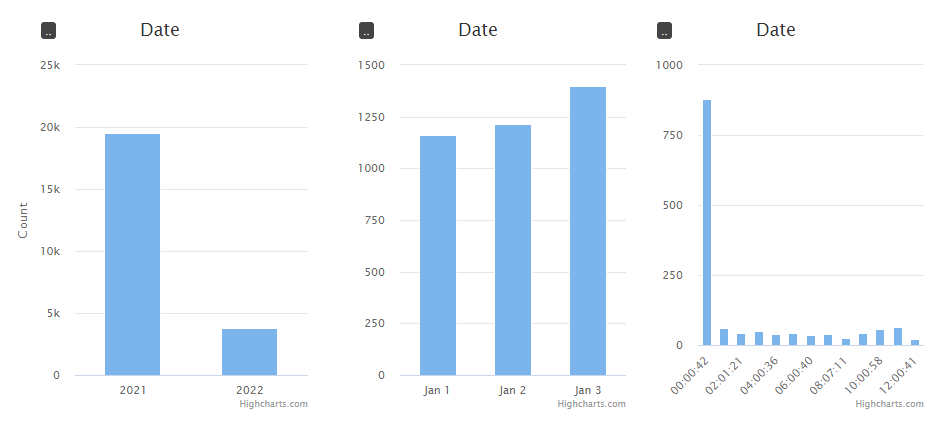
The high traffic at around midnight is alarming. The geographic breakdown shows that most of the traffic came from the US. Let's drill in to a specific region where the traffic was from:
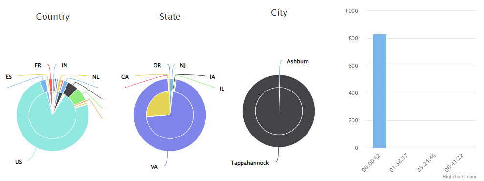
Once the geo filter of State=VA is applied, the timeline confirms the geo-time correlation. We now know for certain that 100% of the requests came from Virginia. In addition, 832 of the 836 requests came from Tappahannock, VA - the location of a data center. The grid shows that "//wp-login.php" was the most attempted page. The HTTP Status breakdown shows 100% Status 200 at this point. This is because the website we are auditing runs Wordpress.
From the server response distribution and the nature of the login page we can detect the "intent" of the attacker. This is a typical brute-force password attack against a Wordpress login page.
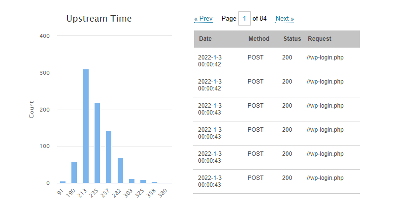
The chart also shows that most of the password attempts took 1/3 of a second, and that the script tried a dictionary of 832 combinations.
Next, clear all the filters and apply Method=POST again. Also apply the date filter to one specific day. This time, we'll exclude Status 200 and see what's remaining:
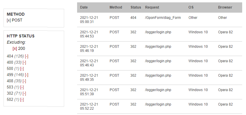
We see that Status 302 is occupying the grid. A good strategy is to eliminate any noises in the grid. Now we exclude both 302 and 200. Status 499 now really stands out. Let's look at 499 exclusively:
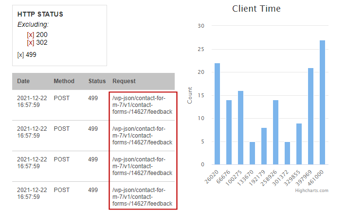
The grid shows a clear pattern - most of the 499's (client-side timeout) were caused by posting to a feedback form in Contact Form 7. CF7 has known privilege escalation vulnerabilities related to file upload. We can also see in the Client Time chart that the connection lasted between 26 to 46 seconds. This gives the Upload/Account Escalation attack the bonus of a Denial of Service (DOS) attack.
Detecting Compromised User Accounts
Next, we will look at a Gyroscope project. For this exercise, our hypothetical careless user uses the same credentials on all his accounts, including a Facebook password that was stored as plain text and subsequently made its way to the wrong hand.
We apply a method=POST filter. This should trim down more than half of the requests. Then under "GS Func", select "wk" - this is the Welcome screen upon the fist Gyroscope load.
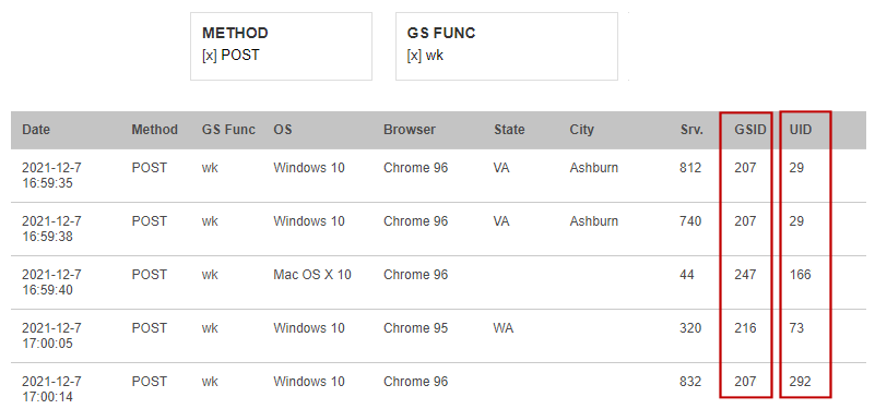
Every Gyroscope request is tracked with a User ID and a GS ID. In a non-multitenant system, all GS IDs are the same.
Next, we exclude all the countries the user has travelled to and worked from:
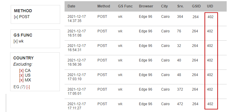
In just a few clicks, the unauthorized login from Egypt was identified. At this point, we know the exact user that's compromised. We can revoke the user's access and apply stronger passwords and additional authentication methods.
Resource Chokepoints
The performance of a web app is the sum of all its components, big and small. It doesn't matter if a simple request is efficient by itself. When the shared resource runs out, even the simplest computation can be significantly slowed down. In fact, we can use these "trivial requests" to identify resource issues.
One such request is "logpump" from logpump.php. The login page invokes the logpump with a superfluous "cmd" switch. The pump computes a short-lived SHA1 hash. This operation should consume no time at all. But the Server Dashboard shows otherwise:
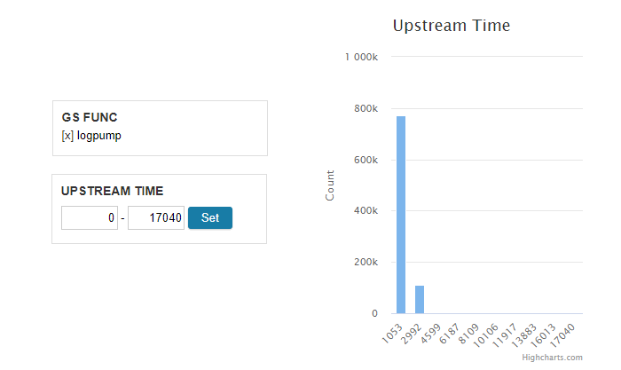
While most "pumps" finished within a second, some took as long as 17 seconds! Let's apply a series of date filters to zoom in to a specific instance.
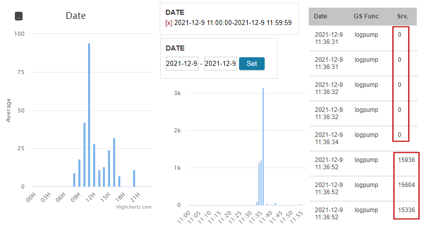
The range filters in the Server Access Dashboard don't work exactly the same as other faceted navigation dashboards. For example, when a range is applied, the input fields for the lower and upper bounds are still available, allowing easy refinements. Once we narrow down to a specific day, type in the YYYY-MM-DD hh:mm:ss format to further expand a day. It's important that the Hour values are the same if you wish to split an hour.
Once we type in 2021-12-9 11:00:00 to 2021-12-9 11:59:59, we see that the slow down spikes at exactly 2021-21-9 11:36:00. Applying the more specific range, we locate the "edge" between a series of quick pumps and one of slow pumps. Now we know, something else happened between 11:36:34 and 11:36:52.
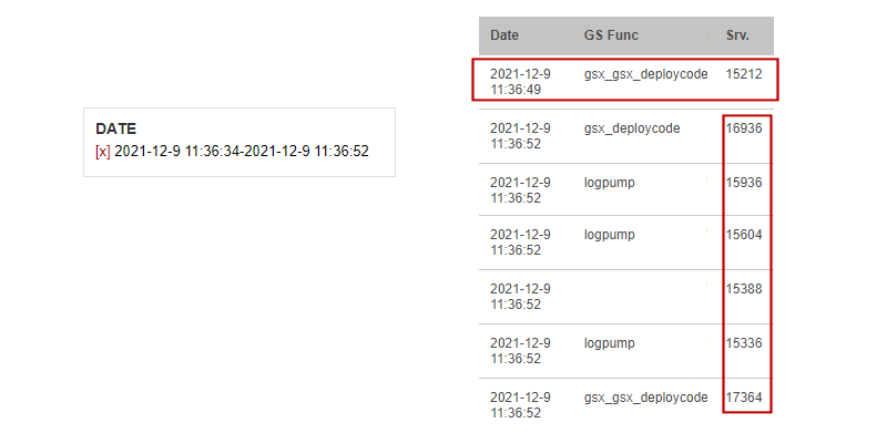
Within just a few clicks, we found the prime suspect "gsx_gsx_deploycode". This request holds the server hostage for a good few seconds due to a CPU exhaustion bug with curl_multi. To further verify that the suspect is indeed the culprit, we invoked the gsx_gsx_deploycode call and reproduced the exact scenario.
Sometimes, the "other request" is not a web call, as we will see in this next example. This time, we use "getchatid" - another request that should complete really fast. getchatid talks to MySQL, so any slowdown might point to database starvation.
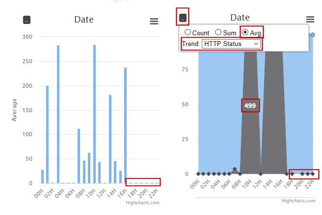
Set the GS Func filter to "getchatid". Set the date range to one whole day. Enable the Average mode in the Date chart:
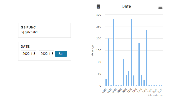
The top average request time is around 280ms. Let's apply a upstream filter so that the lower bound is 280ms:
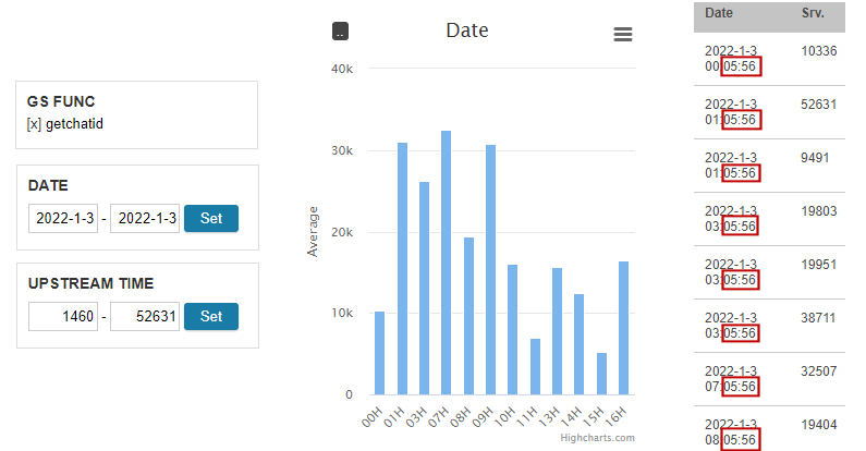
From the Date chart, we see that the slowdown takes place nearly every hour. The grid further confirms the pattern to the very second.
The discovery points to a cron job that runs at the 5th minute of every hour. The job creates a MySQL dump for the entire database. Since the backup script reads from the main database, getchatid, a request that reads from and writes to MySQL, is put on hold. The solution is to perform the backup out of a read-only replica.
After the fix, we can confirm that the average server time of the getchatid request never spiked again. It stayed at a handsome 2ms. We can even use the HTTP Status trend to show that the once dreadful 499 client timeout is now gone: